
If you turn left from Chapel Street onto Orange Street and walk about a block, chances are you’ll see a group of teenagers...
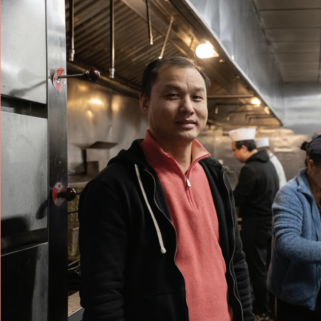
Paul McDuffy has been feeding people since he was 12. “We were raised poor,” he tells me after his Friday shift at Sunrise...
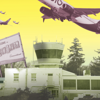
Diana Gilman-Ford doesn’t like to fly. She hasn’t been on a plane since the late nineteen-nineties, and even then, she didn’t make it off the...
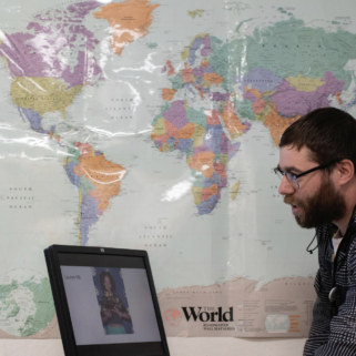
It’s last period, and students in Ryan Boroski’s “African American/Black and Puerto Rican/Latino Studies” stir with anticipation: not of dismissal, but of their in-class assignment....
Dear readers, There are a lot of ways to say goodbye. The poets have tried. Louise Bogan calls it “leave-taking.” Emily Brontë reminds us to...
If you turn left from Chapel Street onto Orange Street and walk about a block, chances are you’ll see a group of teenagers performing kickflips and ollies on the pavement. They’ll be outside...
Paul McDuffy has been feeding people since he was 12. “We were raised poor,” he tells me after his Friday shift at Sunrise Cafe. “And because of being poor, my mom taught us...
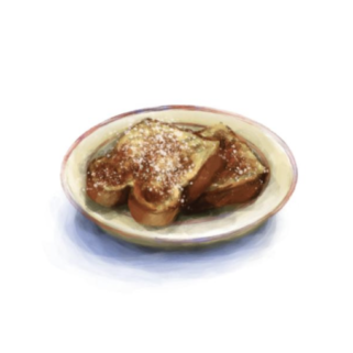
Everything at Chef Jiang seems designed to reflect light. The glossy wooden tables, the seats upholstered in shiny orange vinyl, the oversized oriental vases. Even the plates of food—hot, spicy, and glistening with...
It’s a full house in the gym of High School in the Community. Tennis shoes squeak as students file into silver rows of bleachers. The air fills with the chatter of three hundred...

On a cold February afternoon, ten people scatter among identical rows of chairs in the basement of the New Haven Free Public Library (NHFPL). Between the patterned surfaces, diffusely lit by the overhead...

Diana Gilman-Ford doesn’t like to fly. She hasn’t been on a plane since the late nineteen-nineties, and even then, she didn’t...
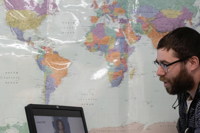
It’s last period, and students in Ryan Boroski’s “African American/Black and Puerto Rican/Latino Studies” stir with anticipation: not of dismissal, but of their in-class assignment....


On a cold February afternoon, ten people scatter among identical...
Also, try the March Crossword:

Yale promises to meet the full financial need of each...

Disclaimer: Four students asked to be referred to by their first initial due to discomfort...

Facebook animal exchange groups make giving away pets as simple as uploading a post— but...

The Yale Prison Education Initiative brings prestige and power into nearby prisons—but not without a cost.

Peer-led policing alternative COMPASS has seen a successful rollout in the past five months. But can an organization bankrolled by the City and run by Yale achieve radical aims?
It is a building that looks like it is hiding. Some windows are blurred with...

The first thing I noticed was the smell. Cedar pitch,...