The Office of the University Printer articulates Yale’s graphic identity in practical terms so that departments and programs can use Yale’s visual brand and tradition of graphic excellence to full advantage. In addition, the University Printer monitors the design and editorial quality of the university’s most visible publications to ensure that Yale benefits from the print and Web publications of its departments. Our office employs graphic designers and editors, who work together on a range of projects that contribute to Yale’s graphic identity and impact its worldwide reputation.
Welcome
Yale’s visual identity
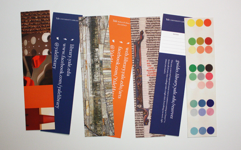
Yale’s visual identity relies on the consistent and effective use of our branding touchstones: the Yale logo and wordmarks, the Yale typeface, and Yale colors. The Office of the University Printer maintains yaleidentity.yale.edu, a style guide for proper implementation of these key signifiers.
Bulletin of Yale University
Under the auspices of the Secretary of the University, the Office of the University Printer annually oversees publication of seventeen course books that comprise the Bulletin of Yale University.
Design and editorial services
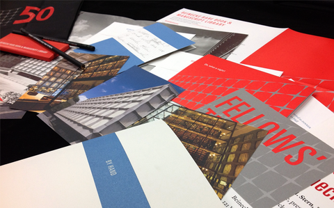
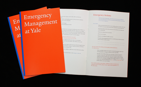
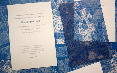
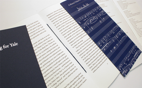
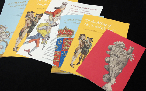
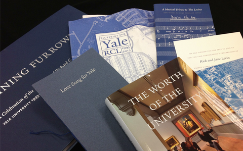
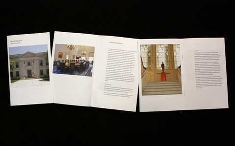
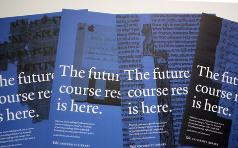
The office also takes on a variety of design, editorial, and publications projects on a contract basis, often in collaboration with Yale Printing & Publishing Services, for academic and administrative offices across Yale. If you have a project that you would like us to consider, please contact us by phone or email.
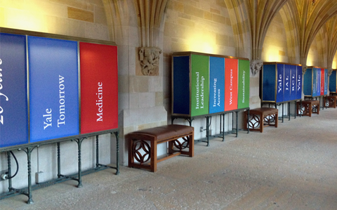
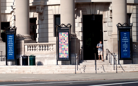
University signage
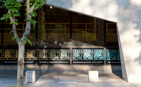
The office manages design and coordination for all university exterior signage and donor recognition graphics. The office provides recommendations regarding interior building signage. To learn more about Yale’s signage system, consult the Yale University Campus Signage manual. To request an exterior sign, complete a Sign Request Form. Please contact the Office of the University Printer with any questions or requests related to signage.
Consultation services
The University Printer consults with departments regarding the planning, cost, and execution of their visual projects. Consultation may focus upon a specific communication or the overall branding of an entity. The University Printer frequently advises departments regarding selection of graphic designers for freelance or in-house employment. The office provides consultation free of charge and works in cooperation with Yale Printing & Publishing Services. To schedule a consultation, please contact us by phone or email.
Branding and design courses and tutorials
The Office of the University Printer provides courses and tutorials to departments and individuals about Yale’s graphic identity, typography, editorial standards, graphic design, and project management. These services are provided without charge to Yale offices and employees.
From the Blog
Winners of the 2023 Lohmann & Van Sinderen Prizes for Excellence in Undergraduate Printing and Design were announced at an April 27 awards ceremony in the Robert B. Haas Family Arts Library.
more entries >|
Office of the University Printer courier |
Rebecca Martz, University Printer Steve Aitken, Bulletin Editor Charles Biada, Sign Specialist Samantha Callahan, Senior Designer Maura Gianakos, Project Administrator Sidney Hirschman, Rollins Fellow |